Rules and systematic approaches in design have long been a subject of debate. Some argue that they provide clarity and consistency, while others question their relevance and claim that they hinder progress. Coming from Finland, where systematic design is in the minority, I have often wondered about the importance of following rules in design.
I’ve seen that often designers have to prioritise flexibility, bending their systematic ways to accommodate client preferences, budget constraints, and limited time. This has led me to question whether the pursuit of systematic design is necessary, or if a more open-minded approach can yield equally satisfying results. Designers who come from backgrounds in fine arts, illustration, or graffiti often approach their work with an open mindset. This light-heartedness can be seen in the unexpected outcomes and playful twists in their designs. Projects created with this mindset often have a personal and unique aesthetic, setting them apart from the vast spectrum of global design work.
However, for a design style or approach to make a lasting impact, it needs to be understandable and reproducible by other designers with a level of consistency. This is where the limitations of the freeform approach become apparent. Pioneers of the systematic approach such as Jan Tschichold, Adrian Frutiger, and Josef Müller-Brockmann emerged from Germany and Switzerland in the early and mid-20th century. Their embrace of cleaner and more minimalistic aesthetics revolutionised visual communication. They introduced new typefaces and embraced grid and design systems, elevating their relevance in the field.

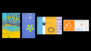
A prime example of systematic design is Otl Aicher’s work for the 1972 Munich Olympics. His design system featured utilitarian typography, an abstract geometric logo, a specific color palette, and a wide range of pictograms. The systematic approach ensured that all elements worked together to create a coherent identity. Aicher’s design principles were not restricted to posters and printed materials alone; they extended across the Olympics venue, surrounding areas, architecture, clothing, and various other forms.
Some argue that in today’s complex world, design has become generic, with superficial appearances of systematic design. Simply using a Sans Serif typeface and basic colour palette may not be enough. Good systematic design requires understanding and insight. It involves comprehending the assignment, desired results, and the purpose of the design. Ultimately, the essence of a designer’s praxis lies in their judgment of what the design should achieve – whether it be laughter, awe, pure communication, all of those, or none of them.

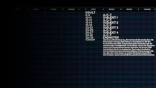
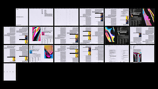
A systematic design approach has become central to my work, as it shows how a few carefully made choices can impact the overall project’s identity. In my view, editorial design serves as a prime example of where a design system is essential, as it involves decisions on content emphasis, hierarchy, and grid systems to support the desired design. I believe that every designer should, at some point in their career, find their systematic process. This can become a valuable tool to analyse the challenges of a project, justify decisions, and implement them effectively. While flexibility and adaptability have their place in design, incorporating systematic principles can help create designs that have a coherent look and feel to them and last the test of time.