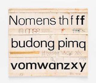
Adrian Frutiger initiated his sans-serif typeface eventually called Univers during Walter Käch’s classes in Zurich. The early sketches are preserved and accessible in the archives of the Museum für Gestaltung. These pre-Univers sketches, from before the typeface’s creation, convey a different feeling, suggesting they could have led to another project if taken up by someone else. This observation served as the starting point for my ongoing type design project.
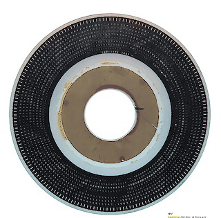
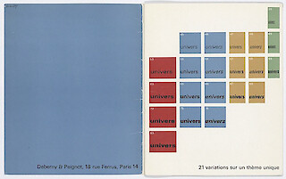
Univers was published by the Deberny & Peignot type foundry in 1957. Originally proposed by Frutiger to the foundry as a substitute for the well-known Futura typeface, Univers would also take advantage of the new phototypesetting technology initiated by Lumitype machines. It has remained a classic in contemporary typography for almost 70 years. Frutiger introduced a system with this typeface, emphasizing the idea that a typeface should create a family of consistent and related designs. In other words, Univers is a typeface composed of various weights and widths, leading to a cohesive use of each cut in a document, for example.
The revival of the pre-Univers sketches offers a valuable experience and introspection into type design and the role of the designer. Reviving a typeface raises various questions, such as legitimacy, respecting previous work, and determining the direction of the revival in a contemporary context. This can result in a font with a distinct appearance and new perspectives. In my case, the slightly square shapes and different curve speeds in the early sketches caught my interest.
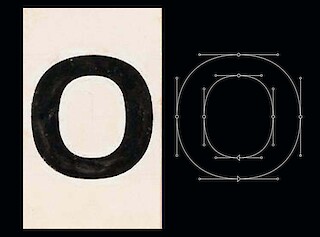
Univers has been through various transformations, evolving from its initial sketches to its early digital versions. This evolution is attributed to the numerous redesigns carried out following each technological advancement in typography, including typesetting and type design. In the Univers specimen designed by Rémy Peignot in 1964, the typeface already appears to have lost much of its distinctive character due to numerous optical corrections and changes applied during realization. While Univers primarily focused on readability and neutrality, some formal aspects that are clearly visible in the Vorprojekt took a backseat.
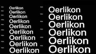
Using the Vorprojekt sketches as a starting point, I embarked on developing a grotesque font with a strong emphasis on readability without sacrificing tension and character, whether used in running text or display. Such qualities lie at the core of many other grotesque projects. At what point do you stop optical corrections or smoothening the curves to avoid erasing the font's character entirely? But also: How long do the rough edges continue to constrain the ultimate goal of the font?