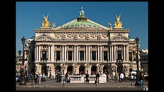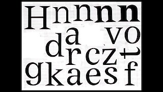
The origin of Adrian Frutiger’s Versaille typeface can be traced to initial sketches of a Latin inscription found at the Opéra Garnier, a historic site in Paris. These typographic nuances, situated about 20 km east of the the renowned château in Versailles, served as a wellspring of creative inspiration for the project. By integrating the enchanting typographic elements from this iconic French locale, Frutiger crafted a typeface that is likely to evoke the grace and sophistication associated with the rich history and culture of France.
Adrian Frutiger (1928–2015), a luminary in type design, is renowned for contributions such as Univers and Frutiger. These iconic typefaces, widely adopted in graphic design, showcase Frutiger’s talent in seamlessly blending aesthetics with functionality. The distinct style of the Versailles typeface, also called French Latin, might be less familiar to contemporary users of typefaces. Vertical symmetry and the large x-height create a unique elegance, accentuated by strikingly sharp triangular serifs. This precision contrasts beautifully with neo-baroque ornamentation, forming a visually captivating tapestry. Every meticulously arranged detail contributes to a seductive aesthetic.

The inspiration for Versailles arose from recognition of a gap in the Latin typefaces available in the Linotype library. In 1984, D.Stempel AG published Versailles in 8 digital fonts for CRT and laser setters from Linotype. Frutiger departed from his regular design method for Versailles, considering the limitations of digital technology at the time. Vectorization, describing curves with short straight lines, couldn’t match the quality of earlier production methods. Although Versailles became available as a PostScript font in 1993, it hasn’t been adapted to meet modern digital demands.
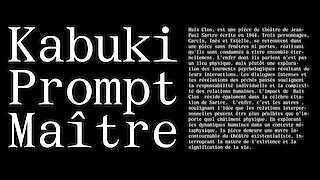
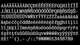
I call my new creation based on Versailles, Opéraga. In this version, subtle yet significant changes have transformed the typeface into a tight monospace style with well-defined strokes. This decision imparts geometric uniformity to the typography, enhancing line sharpness and creating a balanced layout.

Choosing a monospace style adds a contemporary and dynamic dimension, often associated with modern aesthetics and frequently used in computer programming and contemporary design.
In conclusion, Opéraga represents a meticulous revival of Frutiger’s Versailles typeface, infusing it with a contemporary twist. The project seamlessly blends historical inspiration with modern design principles, showcasing a commitment to both legacy and innovation in the world of typography.
